Showing posts with label design. Show all posts

1.07.2009

My Life in Video Game Controllers


Cool Infographics had this little nugget of joy this morning. This is just begging to be made into a t-shirt.

11.05.2008

The Art of Politics

One of the most impressive things about Barack Obama’s campaign has been the level of inspiration he brought out in his supporters. We saw the results of that yesterday in the turnout at the polls, but another area where I’ve been equally impressed is in his effect on the artistic community. Obama supporters have produced some amazing images over the past 9 months, starting first and foremost with underground artist Shepard Fairey’s ubiquitous “Hope” and “Progress” posters, which were originally produced as an independent guerrilla project, but were soon assimilated as official by the Obama campaign. This iconic image spawned numerous alterations, knockoffs and parodies (including a DNC-specific variation by Fairey himself, created for a certain Denver magazine), but one of my favorite remixes combines Obama and David Bowie circa “Aladdin Sane”.
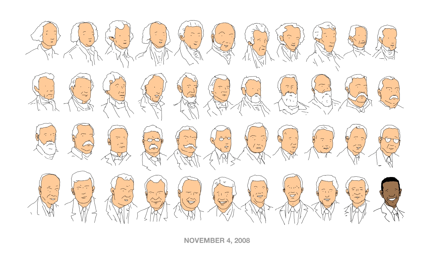

While Fairey’s image was definitely the highest-profile of the campaign, there’s been plenty of creativity to spread around. A huge amount of original artwork was displayed in Denver during the DNC, but this image, produced recently by illustrator Patrick Moberg in honor of President-Elect Obama’s historic victory, is by far my favorite. Simple, yet effective, it truly embodies the old line about a picture being worth 1,000 words.

I, for one, hope that this creative explosion continues throughout President Obama’s entire term, and that he can continue to inspire all Americans, not just the artists, for years to come. (Clearly, my post-election afterglow hasn’t worn off yet. Hope, baby, hope...)

10.24.2008

Posterized

Sometimes, I need a post like this to remind me why I read so many blogs. Good stuff.

8.11.2008

Love Letters

Think you know your movie posters? Well, so did I, until I took this humbling quiz offered up by Empire Online. The idea is to identify the movie based on 1 letter of the title from the movie’s poster. To give you an idea of how hard it is, I’d consider myself to have a better-than-average knowledge of movies and fonts, and I got 16 of 46. Frustrating, but it also made me want a second quiz. Soon.

12.17.2006

Poster Exchange

While I may not agree with all the choices, I like Sam Smyth's idea of ranking 2006's best movie posters. After a long period of predictablity and unoriginality, interesting and creative design is beginning to make a comeback, at least for movies outside the realm of the typical blockbuster. My personal top pick would be the above poster for The Illusionist, but then again, I'm a type nerd.
WATCH
Scarface
Superman Returns

READ
The Hitchhiker's Guide to the Galaxy, Douglas Adams

11.20.2006

Eye Candy

I haven't figured out yet whether this is incredibly cool or incredibly nerdy (especially since the two things are often the same in my mind). Jim at Krazydad created the image above by arranging old science fiction magazine and novel covers chronologically and by hue. Here's his explanation of the piece. The best part is, it only took him a day to do. Thanks to Wired for the link.

Speaking of nerdy, here's my design nerd kicking in. After posting about my love of posters, I've been spending more l time looking at different designs on the web, and I discovered that AIGA Atlanta and Neenah Paper have commissioned some of the biggest names in design to each create a poster for a different punctuation mark. The posters will be auctioned off, with the money going to benefit a guy named Scott Hamilton, a designer in the ATL who suffered a stroke, losing the ability to do most of the things we take for granted, like walk, read, write, use his hands and verbalize his thoughts. Pretty frightening, especially since he was only 42. So not only were these pieces created for a good cause, but the majority of these are inspired works. My favorites? Michael Beirut's "Semi-Colin", Chip Kidd's "My-Hyphenated-Life", and Stefan Sagmeister and Matthias Ernstberger's take on the apostrophe, "Happiness is a warm bang bang, shoot, shoot". I guess being a smart-ass can translate into creativity sometimes. Plus, looking at this work has inspired me to take on a freelance project to design a poster of my own. More on that when I can show you a finished piece.

In other news, I've decided to stop fighting nature and grow a mustache. Of course, I'm sure I'll change my mind tomorrow morning and shave it off before work. But for one weekend, I joined the ranks of such facial-hair celebs as Burt Reynolds, Tom Selleck, Edward James Olmos, and Jason Lee. OK, I'm kidding. I just didn't shave this weekend. Seriously, though, I would totally grow a mustache if Mustaches for Kids would start a Denver chapter.

And finally, since I mentioned Edward James Olmos, I have to talk about my new favorite show, Battlestar Galactica. I finally finished the first two seasons on DVD and I'm now working my way through the current season on my DVR. Yes, it's based on that über-cheesy show from the 70's. But other than the basic premise and the names of the characters, the two shows don't have a whole lot in common. The new one is superbly acted with a pretty impressive cast, and everything about it is based on real science (for instance, no lasers—the guns shoot bullets). But what I like best about this new version is, at its core, it's a drama that just happens to be set in space. Within the framework of the remnants of humanity on the run from the Cylons, the show has dealt with topics like abortion, genocide, terrorism and suicide bombings, imprisoning "enemy combatants", the politics of war, and other hot-button political issues. Not gonna much of get that from Star Trek.
WATCH
Kiss Kiss Bang Bang
Battlestar Galactica Season 2.5: Disc Two
Battlestar Battlestar Galactica Season 2.5: Disc Three
Rock the Bells

READ
World War Z, Max Brooks
Four Plays by George Bernard Shaw

LISTEN
The Best of What's Around, Vol. 1, Dave Matthews Band
The Crane Wife, The Decemberists
And the Glass Handed Kites, Mew
Colorblind, Robert Randolph & the Family Band
Deadringer, RJD2
Chrome Children, Stones Throw artists

10.20.2006

Poster Boy

Collecting has never held much appeal for me, mainly because it's not often that I stay interested in something long enough to want to collect it. However, aside from guitars, which are out of my reach for financial reasons, there is one item that I've recently decided is worth investing in. My love of music and my love of design and typography are two fairly constant things in my life, and there is a place where those disciplines meet: the rock poster.
Now, just so we're clear, I'm not talking about your classic glossy group shot posters you pick up in the back of Sam Goody for $5.99 and throw up on your dorm room wall with StickyTack. These are limited-edition, hand-printed designs. Back in the 50's and 60's, it was fairly common for bands and venues to produce a different poster for each show, often to advertise a festival or package tour with a variety of artists. To some extent, this practice fell out of fashion in the 70's and 80's as punk turned more towards flyers and rock bands went the Sam Goody route to fill their poster needs. But in the 90's, as design became a larger part of the American landscape and new houses and agencies sprang up all over the country hungry for work, the single show poster returned. Some of the biggest proponents of this trend were the Seattle bands, most noticeably Pearl Jam, who hired firms around the country, including Ames Bros, who produced the posters pictured above. (I own a copy of the one with the pig-faced guy in plaid pants towards the lower right.)

Rock posters hold a strong appeal for me because there are very few limits placed on the designers, leading to some incredibly creative work. Designers will often draw from retro pop culture, and robots and monsters are common themes. Plus, the letterpress and screenprinting gives the finished product a raw, hand-crafted feel that's very appealing to me. I'll often turn to posters when I'm looking for inspiration in my own design, or just when I need to remind myself why I do what I do. Apparently, I'm not the only one. UnBeige recently posted about rock posters, which was prompted by reading this post from Crit. It seems my love of the poster is not unique.

Currently, my collection looks like this: besides my Ames/Pearl Jam poster, I also own a set of 4 Nickel Creek posters I got from their website, and a Hank Williams poster and a Johnny Cash poster both created by Hatch Show Print in Nashville, the granddaddy of the letterpress rock poster.

Since I am a "collector", I always keep my eye on a few places to see what's available. As the trend speads to more and more bands, many of them will sell posters from past tours on their website (as Dave Matthews Band is doing right now). This is not a bad way to pick up pieces inexpensively, but I prefer to go directly to some of the smaller studios who produce the posters. One of my current favorites is The Small Stakes, a small one-man shop who creates some fantastic posters for a bunch of bands I happen to like. Unfortunately, he produces pretty limited numbers, and his stuff tends to sell out pretty quickly. I also check out other artists whenever I find them. For instance, tonight I discovered Tara McPherson and El Jefe Design, the studio owned by the author of the Crit blog post I linked to above.

Some of the more famous designs have become pretty scarce. Luckily, there are still ways to see most of them. GigPosters.com is a fantastic resource, although it also makes for dangerous late-night surfing. I tend to hide my credit card before I visit. There's also no shortage of coffee-table book collections and historical looks at the industry. For current stuff, try:
Art of Modern Rock: The Poster Explosion (I own this one. It's a great round-up of the current resurgence of the rock poster.)
Swag: Rock Posters of the 90's

And to dive into the history, I'd start with these:
Hatch Show Print: The History of a Great American Poster Shop
The Art of the Fillmore
The Art of Rock: Posters from Presley to Punk

Finally, no collection would be complete without a way to preserve it. I order 2" black wood frames and plexiglass fronts from Frames By Mail to protect my posters. Frames By Mail will custom-cut to fit whatever size you need (this comes in handy since most rock posters are not made to fit standard-size frames), and it's usually cheaper by half than going to a framing store. Plus, I've never waited longer than 3 days for an order.

I'm making no claims to be an expert, but as a whole, I think the current crop of rock posters are pretty damn cool, and are something that I might even like to create myself someday. And if that's not worth collecting, I don't know what is.

If you like dark humor, I'd highly recommend checking out Thank You for Smoking. Doug and I watched it the other night, and it had us both laughing. Great performances from a sharp cast, but Aaron Eckhart impressed me the most.
READ
The Golden Compass, Philip Pullman

WATCH
Thank You For Smoking

7.12.2006

Little Shots of Happiness

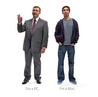
Every once in a while, a series of commercials comes along that I get inordinately attached to. I get a stupid little rush of excitement every time I see one, and no matter how many times I see them, they never fail to make me laugh. Right now, it's Apple that's responsible for my 30-second fixes. I don't whether it's because I'm a life-long Mac user (our first family computer was an Apple IIc that my Dad bought in the late 70's), or just because I find these ads to be unfairly clever at the expense of some computer-geek stereotypes, but I can't get enough of them. I can't escape them either. Thanks to the juggernaut that is Apple's marketing department, whether I'm watching TV or on the internet, there's the Mac and the PC. Also, I love that the guy who plays the Mac is the same kid who got nailed with a wrench by Patches O'Houlihan.

Other things making me happy these days?

Pearl Jam, "Wishlist". After digging out my CDs during the move, I'm having a bit of PJ renaissance these days, and their greatest hits discs have been in heavy rotation as I drive around Denver. "Wishlist" is a track I had almost entirely forgotten, but now I can't get enough of. "I wish I was a messenger and all the news was good / I wish I was the full moon shining off a Camaro's hood." Cheesy goodness.

Neil Finn and Friends, 7 Worlds Collide: Live at the St. James. Another gem I dug out. The former Crowded House frontman gathered a bunch of guest stars (including members of Radiohead, the Smiths, and Pearl Jam) for a series of concerts in New Zealand. I don't even know that many of the songs, but this disc makes me wish I had been at the show. And really, what more can you ask for from a live album?

Anything by Mark Twain. I've been there before. When I was young, I had an illustrated version of Adventures of Huckleberry Finn, and when we read the grown-up version in high school, it was one of the only books I've been forced to read in my life that I truly enjoyed. I've read The Adventures of Tom Sawyer, and I own a collection of Twain's best quotes. But the mark of a great writer is, no matter many times you read their stuff, you always come back for more. Thanks to a few visits to the nearby Tattered Cover bookstore, I've stocked up and plunged deeper into Samuel Clemens' oeuvre. I just finished re-reading Tom Sawyer and Huck Finn, and am now about to start A Connecticut Yankee in King Arthur's Court. On deck: Life on the Mississippi and Innocents Abroad. If nothing else, Twain's words are helping pass the time in my crap-ass sublet.

Things not making me happy?

My crap-ass sublet. The sooner I find a permanent place to live, the better.

The logo for World Cup 2010 in South Africa. Ew. It's the biggest sporting event in the world. You'd think maybe they could spring for a graphic designer with a few years of training.

3.11.2006

The Blahs

No, not my mood. For no particular reason, I decided to search Blingo for "blah blah blog" today, and after 54 pages of links and not a single mention of my page, I've concluded that there are about 47,310 blogs with the same name as mine, which is about 47,309 too many. So look for a name change fairly soon, as soon as I can stop grinding my teeth about work long enough to think of one.

Speaking of work, I'm going to break one of my two rules for this blog (because so many people from both these parts of my life read this, no bitching about work and no discussing my love life) for a brief moment here: one of the dangers of the accessibility of design software over the past decade or so is that now everybody thinks they're a designer. If one more editor questions me on a font choice or color selection or whether something is visually spaced correctly, they're going to require major surgery to have my keyboard removed from their ass. I read what goes in the magazine, and I have an opinion about it, but that doesn't make me an editor. Now if I went back to school and got my journalism degree, then I could complain. And when the editors I work with get their BFAs and have 10+ years of experience laying out magazines, then they can talk to me about leading and kerning and why we can't use the bold weight of our san serif font instead of the semibold weight of the serif font for that caption that had to absolutely be squeezed onto a very self-explanatory photo with a busy background in a layout which I designed using only the serif font.

Whew. OK, I feel a little better.

So, lots of soccer stuff since my last post:
I know this was more than a week ago, but the Nats earned a rare win on European soil, beating Poland 1-0 in the snow in Germany (Lewis and Galarcep analysis). Clint Dempsey scored the only goal, furthering his cause for inclusion on the WC roster.

In MLS, the Name Game continues. Houston 1836 (nee San Jose Earthquakes, nee San Jose Clash) changed their name to Houston Dynamo because of protest in the Hispanic community that 1836 was the year Texas won its independence from Mexico. Apparently, 170 years is not too long to hold a grudge in Texas, but don't you think it might have been a wise idea for team officials to figure that out before they had a press conference announcing the name and colors and logo? And what's going to happen when the Ukranian community in Houston starts protesting that they stole the name from Kiev's greatest team?

And over on the Eastern Seaboard, an infusion of new money into MLS is creating a lot of flap, as Red Bull, (makers of the energy drink of the same name who also own a team in Austria) swooped in to purchase the NY/NJ Metrostars this week, immediately rebranding them "Red Bull New York" (Galarcep analyzed this too). New Jersey officials immediately took umbrage, and I think rightly so, seeing as how the team plays at the Meadowlands and is building a new stadium in Harrison, NJ, neither of which are in New York. Ugly new uniforms will be unveiled when they open the season April 2 at home to my beloved DC United. No matter how they change their look and despite what team president and GM Alexi Lalas has to read from a teleprompter, they still don't have any trophies.

Both MLS participants in the CONCACAF Champions Cup traveled to Costa Rica this week to get knocked out of the tournament, as the LA Galaxy blew a 2-0 lead to lose 3-2 in overtime, and New England lost 1-0 to LD Alajuelense. Here's another example of why MLS desparately needs their own stadiums for every team so that they can start playing on the same calendar as the rest of the world. MLS teams have won this tournament twice in 11 years (LA in 2000, DC in 1998), but usually they tend to crash out early because they're barely into their preseason and are playing teams that are in midseason fitness. Granted, LA played a magnificent first half on Wednesday, and they got totally jobbed on the phantom foul that led to the overtime winner for Saprissa, but they were a completely different team in the second half and lost their legs at about the 70th minute. I tihnk it's far to say that they deserved to lose the match.

On a sad note, however, LA's president and GM, Doug Hamilton, died of a heart attack on the plane returning from Costa Rica. He was only 43, and left behind a wife and young son. Hamilton had worked for LA and the now-defunct Miami Fusion over the past 6 years. The Galaxy were planning to stay in Costa Rica for training, but are returning to the US for the funeral. They have established a fund in support of Hamilton's son, and I would hope the team will wear a patch or armband in his memory for their opener on April 1.

And finally, heading across the pond, I caught the tail end of today's Chelsea-Tottenham match. What an amazing finish, and a heartbreaker for Tottenham. But seeing William Gallas' game-winning strike really brought home the difference in quality between MLS and the Premiership. Granted, Chelsea is a superclub and have amazing players at every postion, but you'd never see an MLS right back hit a shot like that. Hell, half the forwards in MLS probably couldn't hit that shot.

2.28.2006

Catch Up

As I stated so eloquently yesterday, I've got a mess of stuff to talk about, so here it is:

James Jean. If you read my recent post about Fables, you might recognize James' work from the covers of the collections. But he's also done some great work for Spin lately (pictured here), as well as some excellent stuff for other magazines and comics. I'm especially digging his cover for Green Arrow 50. But my favorite part of James' site is his blog, which gives the reader insight into how he works. Very cool stuff. I'd love to hire him, although I'm not exactly sure "Top Doctors" or "12 Hot Neighborhoods" is really his thing.

The Weathered Look. I'm always looking for new ways to make my layouts interesting, and lately I've been playing with different ways to antique or weather objects artificially. I've tried a lot of different things, both hand-crafted and digital, but recently I came across a handy little set of Photoshop filters that might make life a little easier. MisterRetro has created some very cool effects with his Machine Wash Filters which seem like they could be a massive step down the road towards getting that weather-beaten look. And for only $32 per disc, what a bargain!

...and the #1 song in the nation is... Here's a fun thing. You can select any day of the year (ideally your birthday) and find out what the #1 song was on that date every year since Billboard has been keeping its charts. The day I was born, the top song was "Midnight Train to Georgia" by Gladys Knight & the Pips. But my favorite birthday #1 is definitely 1990: "Ice Ice Baby". Word to your mother.

And finally, Füssball. The Nats take on Poland tomorrow in Kaiserslautern, Germany (TV coverage on ESPN2 at 2 pm eastern). This will be a good chance for the US to see one of the stadiums where they'll play this summer (they face Italy in the same stadium on June 17), but more importantly, it's a chance to work European players into the squad. Barring injuries or big surprises over the next two months, tomorrow's lineup should be very similar to the starting 11 who line up for the first match of the World Cup. The Yanks traditionally don't play well in Europe, so it will be interesting to see how they do tomorrow. Surprisingly, there should be a strong American presence in the crowd due to nearby Ramstein Air Force Base. After playing in front of so many hostile crowds in the US, it might be nice to play in front of a friendly crowd across the pond.

Like it or not, soccer is working its way into the American conciousness. Here's two articles from This Is American Soccer and The Sports Network that take two different angles but both suggest the same thing: soccer is already here, and it's just around the corner from huge popularity. Thanks to Todd and my dad for the links.

1.11.2006

Looking into the future

What with movie award season in full swing, I thought I'd give you a glimpse at what's guaranteed to be 2006's biggest blockbuster. Superman Returns? Harry Potter and the Order of the Phoenix? A Narnia sequel? Spielberg or Jackson's next epic? No, my friends. Following Woody Allen's cue, this director is making a return to form, going back to what made him famous in the first place... filthy dialogue and trivial geek-speak spewed forth from the mouths of New Jersey slackers. Ladies and gentlemen, I give you... Kevin Smith's Clerks 2. This trailer got me so fired up, I had to buy the song from iTunes. (That would be Anthrax's re-recorded version of "Among the Living" from their 2004 album, The Greater of Two Evils.)

Speaking of geek-speak, it seems Chuck Klosterman (who I usually find a little tiresome in Spin and Esquire) is now writing a column for ESPN.com's Page 2. His topic? Why we feel the need to compare white athletes to other whites and black athletes to other blacks. Aside from being one of the weirdest and most thought-provoking columns I've ever read on ESPN's site, I challenge anyone to find another sports-related article which quotes the editor-in-chief of Slam magazine and Malcolm Gladwell. And as a second challenge, try to find at least 10 regular ESPN.com readers who know who Malcolm Gladwell is. Needless to say, I thoroughly enjoyed this piece.

And while on the subject of thought-provoking articles, I couldn't pass this one up. On Sunday, the New York Times ran the ultimate typography-nerd story. Unfortunately, it's already gone into their pay archive, but the gist of it is, a small segment of designers and type nerds are up in arms about the anachronistic use of typefaces in movies. The current example? In Good Night and Good Luck, the CBS logo, shown prominently in the studio where much of the film takes place, is set in Helvetica. However, the movie takes place in the early 50's, and Helvetica wasn't created until 1957. For more on the misuse of typefaces in period movies, see Mark Simonson's Typecasting. As a bit of a type nerd and also someone who examines printed materials on film much more closely than the average person, I find this whole thing very interesting, but also somewhat funny. Perspective, people.

12.07.2005

It's OK. Judge a book by its cover. It keeps Chip Kidd in business.

I had a pleasant surprise today when someone at work told me that Chip Kidd would be speaking at the Herron School of Design tonight. Kidd is the name in book cover design, and as close as it gets to a professional "hero" for me. He has worked for Alfred A. Knopf Publishing for 20 years, and after designing for such diverse authors as David Sedaris, James Ellroy, Augusten Burroghs and Cormac McCarthy, you probably have at least one of his covers on your bookshelf. Being a bit of a superhero/comic freak, Kidd has also designed hardcover collections of Charles Schultz's Peanuts and DC Comics's icons, and as I learned tonight, revamped the Superman and Batman logos for DC's new line of All-Star comics. And finally, Kidd is also the author of a novel, The Cheese Monkeys, a vaguely autobiographical account of his experience in design classes at Penn State and one of the only books I've ever read where the design takes an active role in how you read the book.

Kidd's talk tonight was pretty enjoyable, especially since Indy is pretty starved for appearances by designers (or important artists of any sort). My friend Michael (who's also my boss) and I grabbed this rare chance to get our collective design nerd on, and it gave me my first chance to see the inside of Herron's new digs on IUPUI's campus. Pretty sweet, and a far cry from the old Army barracks where I began my collegiate art classes. As a speaker, Kidd was everything I expected from a well-known art director: he was witty, self-deprecating, a little nerdy, and an arrogant bastard who managed to offend most of the audience at one point or another, but still had us all laughing most of the time. He was alternately instructive and dishy about subjects like the diva-ness of certain authors (I won't name names, but she recently switched topics from vampires to Jesus), and I was happy to hear that book publishing is not all that different from magazine publishing in terms of the cause of their headaches. Despite his rock star status, Kidd is the #2 art director at Knopf and has no desire to be #1 and take on all the administrative duties and direct flak involved. It's nice to know that I'm not the only one who feels that way. But most of all, I enjoyed seeing some of his current work, and I came away feeling refreshed and wanting to try new things at work. Not a bad evening.

If you'd like to learn more about Chip Kidd, Jason Santa Maria has a similar post. Only with less rambling and more information. And nicer design.