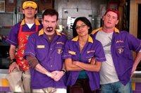
 What with movie award season in full swing, I thought I'd give you a glimpse at what's guaranteed to be 2006's biggest blockbuster. Superman Returns? Harry Potter and the Order of the Phoenix? A Narnia sequel? Spielberg or Jackson's next epic? No, my friends. Following Woody Allen's cue, this director is making a return to form, going back to what made him famous in the first place... filthy dialogue and trivial geek-speak spewed forth from the mouths of New Jersey slackers. Ladies and gentlemen, I give you... Kevin Smith's Clerks 2. This trailer got me so fired up, I had to buy the song from iTunes. (That would be Anthrax's re-recorded version of "Among the Living" from their 2004 album, The Greater of Two Evils.)
Speaking of geek-speak, it seems Chuck Klosterman (who I usually find a little tiresome in Spin and Esquire) is now writing a column for ESPN.com's Page 2. His topic? Why we feel the need to compare white athletes to other whites and black athletes to other blacks. Aside from being one of the weirdest and most thought-provoking columns I've ever read on ESPN's site, I challenge anyone to find another sports-related article which quotes the editor-in-chief of Slam magazine and Malcolm Gladwell. And as a second challenge, try to find at least 10 regular ESPN.com readers who know who Malcolm Gladwell is. Needless to say, I thoroughly enjoyed this piece.
And while on the subject of thought-provoking articles, I couldn't pass this one up. On Sunday, the New York Times ran the ultimate typography-nerd story. Unfortunately, it's already gone into their pay archive, but the gist of it is, a small segment of designers and type nerds are up in arms about the anachronistic use of typefaces in movies. The current example? In Good Night and Good Luck, the CBS logo, shown prominently in the studio where much of the film takes place, is set in Helvetica. However, the movie takes place in the early 50's, and Helvetica wasn't created until 1957. For more on the misuse of typefaces in period movies, see Mark Simonson's Typecasting. As a bit of a type nerd and also someone who examines printed materials on film much more closely than the average person, I find this whole thing very interesting, but also somewhat funny. Perspective, people.
3 comments:
Okay, that Klosterman piece...I confess, I stopped reading before the end. Holy thinking too much!
That typography stuff was cool.
Yeah, that's usually my problem with Klosterman. There's dissecting something for comic effect, and then there's thinking about something waaay too much.
As for the type stuff, that's apparently just a small collection of articles. I've gone on to find several other typography blogs. For instance, Typophile is message boards for type nerds.
Post a Comment